

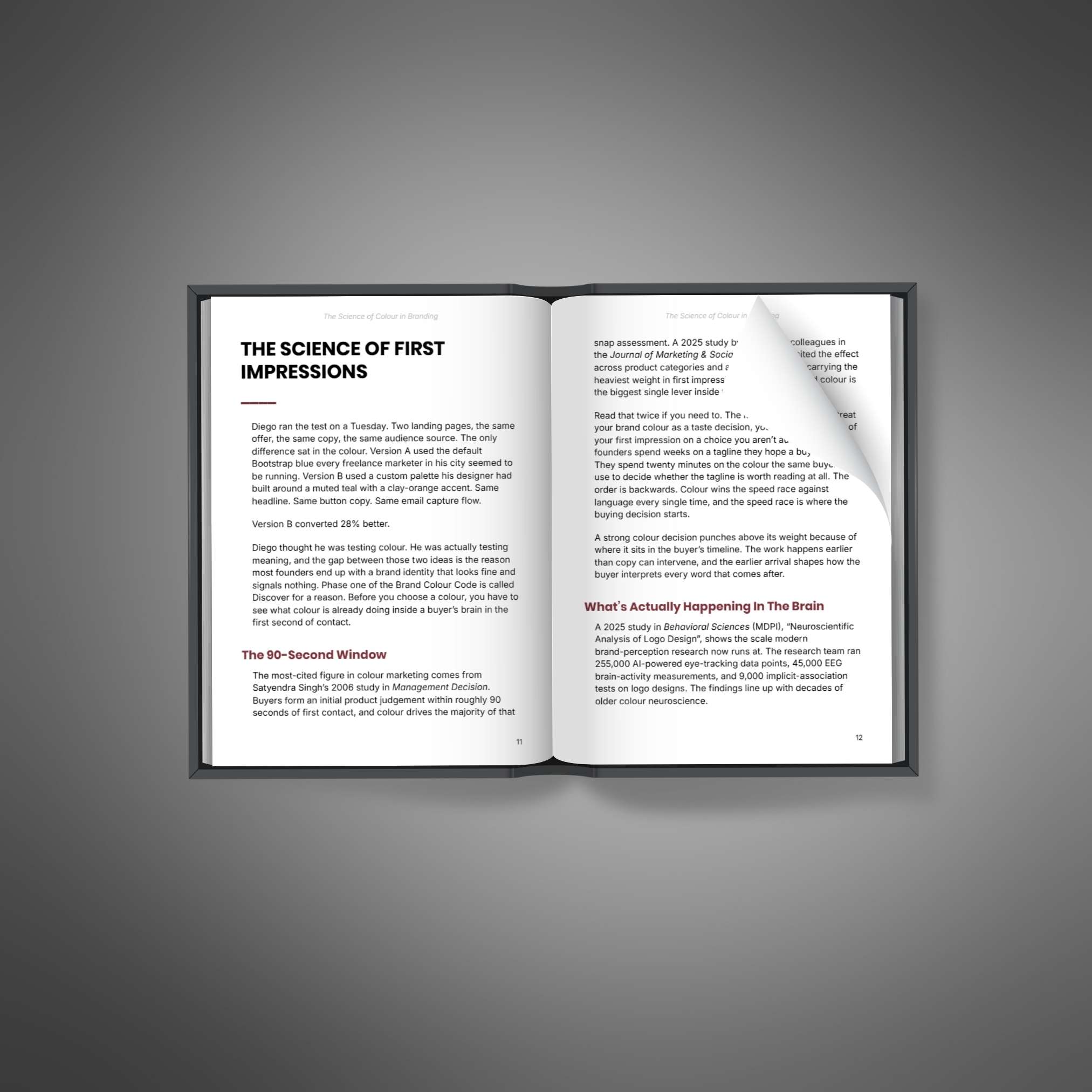
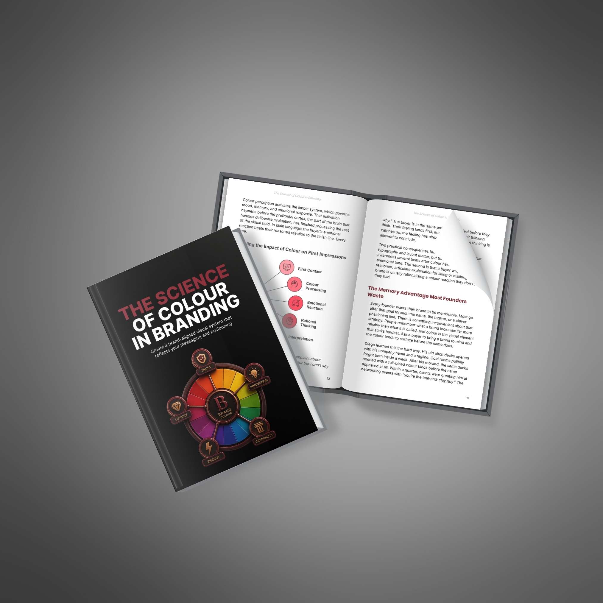
The Science of Colour in Branding collection brings together the main ebook and its companion resources. Use the ebook for the core ideas, then explore the other included formats to apply, review or revisit the topic. This family package includes all the learning resources listed below, not just the main book.
About the main ebook
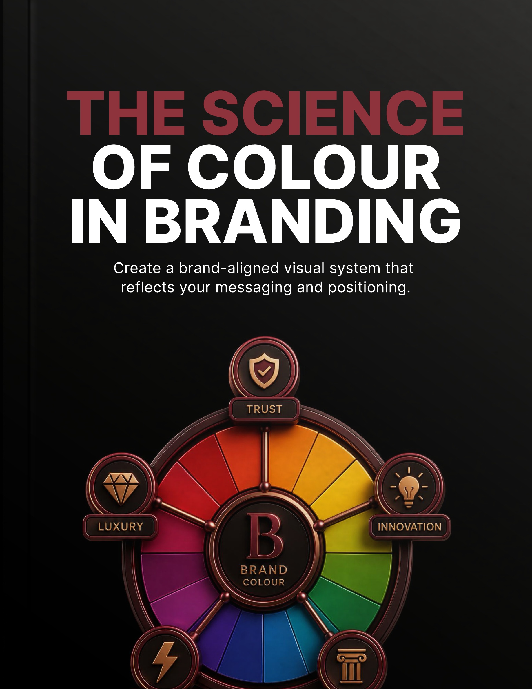
Science of Colour in Branding is an ebook about approaching brand color as a positioning decision rather than a matter of personal taste alone. It explores how a written brief, competitor context and the signals associated with color can inform a more deliberate choice. The guide provides a way to question a palette before committing it to every customer-facing surface.
The book introduces the Brand Colour Code, a five-phase approach that moves from understanding color's role to maintaining a usable system. Its themes include a four-tier palette, dark-mode applications and accessibility testing before launch. Treat the psychological and design ideas as things to examine in context, not as universal rules that predict how every customer will respond to a particular color.
What you will learn about a brand color system
- Frame the decision: Connect color choices with positioning and the impression your brand intends to communicate.
- Write a useful color brief: Use defined criteria and competitor context to evaluate candidates more consistently.
- Consider color signals: Explore associations and first impressions while keeping your audience and application in view.
- Build a coordinated palette: Look at a four-tier system and how its colors can work across different surfaces.
- Review accessibility and dark mode: Consider contrast testing, WCAG 2.2 themes and the demands of alternative display conditions.
- Maintain the system: Think about documenting and governing color choices as new materials and brand needs develop.
Who this ebook is for
This ebook is intended for entrepreneurs, brand owners and people involved in choosing or maintaining a visual identity. It is relevant if a palette is being selected mainly through preference, if applications are becoming inconsistent or if accessibility has been left until the end of the design process. Readers working with a designer can also use its themes to prepare clearer questions and a more useful brief.
Evaluate a palette before expanding its use
Begin with a real brand and a few representative surfaces, such as a website, a document and a social graphic. Write down what the palette needs to communicate and where it must remain readable. Use the book's framework to compare options, then test actual combinations rather than relying on a color swatch alone. Accessibility claims require checking the finished application; reading a guide does not certify a design or guarantee a particular audience response.
Included in this collection
- Science of Colour in Branding: Ebook; 1 PDF; 67 pages.
- Build Your Brand Colour System in 7 Days: Mini-Course; 2 PDFs; 19 pages.
- 20 Colour Mistakes That Make Brands Blend In: Listicle; 1 PDF; 23 pages.
- Brand Colour Code: Audio; 21 minutes.
- Brand Colour Strategy: Prompt Pack; 1 PDF; 35 pages.
- Pre-Launch Brand Colour Stress-Test: Checklist; 1 PDF; 7 pages.
- Write the One-Page Colour Brief: Guide; 1 PDF; 27 pages.
Collection details
Total written resources: 178 pages and 27,482 words across 7 PDFs. These totals cover all included written files, including companion materials and any supplied setup instructions.
Also includes 1 audio/video file, approximately 21 minutes in total. Spoken content is separate from the written word count.
Download availability: After payment, download the complete ZIP package or any of the 7 included PDFs separately.